android xml实现按钮的圆角、阴影效果及按下变化效果的实现代码
前言
5个xml文件实现 按钮的圆角、阴影效果以及按下变化效果
实现
drawable/shape.xml
<?xml version="1.0" encoding="utf-8"?>
<shape xmlns:android="http://schemas.android.com/apk/res/android" >
    <!-- 圆角 -->
    <corners
        android:radius="8dp"
        android:topLeftRadius="5dp"
        android:topRightRadius="5dp"
        android:bottomLeftRadius="5dp"
        android:bottomRightRadius="5dp"/><!-- 设置圆角半径 -->

    <!-- 间隔 -->
    <padding
        android:left="2dp"
        android:top="2dp"
        android:right="2dp"
        android:bottom="2dp"/><!-- 各方向的间隔 -->

    <!-- 大小 -->
    <size
        android:width="50dp"
        android:height="50dp"/><!-- 宽度和高度 -->

    <!-- 填充 -->
    <solid
        android:color=" #FF03A9F4"/><!-- 填充的颜色 -->
</shape>
drawable/shapepress.xml
<?xml version="1.0" encoding="utf-8"?>
<shape xmlns:android="http://schemas.android.com/apk/res/android" >
    <!-- 圆角 -->
    <corners
        android:radius="8dp"
        android:topLeftRadius="5dp"
        android:topRightRadius="5dp"
        android:bottomLeftRadius="5dp"
        android:bottomRightRadius="5dp"/><!-- 设置圆角半径 -->

    <!-- 间隔 -->
    <padding
        android:left="2dp"
        android:top="2dp"
        android:right="2dp"
        android:bottom="2dp"/><!-- 各方向的间隔 -->

    <!-- 大小 -->
    <size
        android:width="50dp"
        android:height="50dp"/><!-- 宽度和高度 -->

    <!-- 填充 -->
    <solid
        android:color="#FF7AD1F8"/><!-- 填充的颜色 -->
</shape>
drawable/shadow.xml
<?xml version="1.0" encoding="utf-8"?>
<layer-list xmlns:android="http://schemas.android.com/apk/res/android">
    <!--第一层阴影-->
    <item>
        <shape android:shape="rectangle">
            <solid android:color="#21000000" />
            <corners android:radius="8dp"
                android:topLeftRadius="5dp"
                android:topRightRadius="5dp"
                android:bottomLeftRadius="5dp"
                android:bottomRightRadius="5dp" />
            <!-- 大小 -->
            <size
                android:width="50dp"
                android:height="50dp"/><!-- 宽度和高度 -->
        </shape>
    </item>
    <!--第二层前景-->
    <item
        android:bottom="2dp"
        android:right="3dp"
        android:drawable="@drawable/shape"
        >
    </item>
</layer-list>

drawable/shadowpress.xml
<?xml version="1.0" encoding="utf-8"?>
<layer-list xmlns:android="http://schemas.android.com/apk/res/android">
    <!--第一层阴影-->
    <item>
        <shape android:shape="rectangle">
            <solid android:color="#0E000000" />
            <corners android:radius="8dp"
                android:topLeftRadius="5dp"
                android:topRightRadius="5dp"
                android:bottomLeftRadius="5dp"
                android:bottomRightRadius="5dp" />
            <!-- 大小 -->
            <size
                android:width="50dp"
                android:height="50dp"/><!-- 宽度和高度 -->
        </shape>
    </item>
    <!--第二层前景-->
    <!--第二层前景-->
    <item
        android:bottom="2dp"
        android:right="3dp"
        android:drawable="@drawable/shapepress"
        >
    </item>
</layer-list>

drawable/button_style.xml
<?xml version="1.0" encoding="utf-8" ?>
<selector xmlns:android="http://schemas.android.com/apk/res/android">
    <!--注意先后顺序-->
    <!-- 触摸模式下单击时的阴影-->
    <item android:state_pressed="true"  android:drawable="@drawable/shadowpress"  />
    <!-- 默认时的背景图片-->
    <item android:drawable="@drawable/shadow" />
</selector>
activity_main.xml中引入
<Button
  android:id="@+id/button9"
  android:onClick="pushNumber"
  android:text="9"
  android:background="@drawable/button_style"
  android:textColor="@color/colorWhite"
  android:layout_margin="5dp"
  />
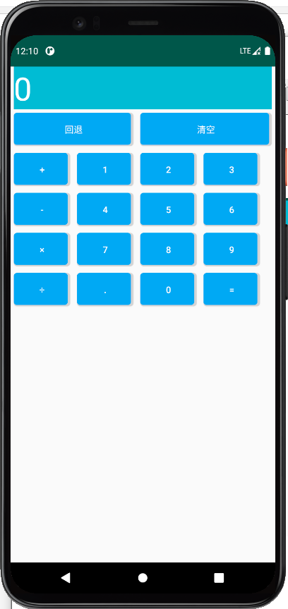
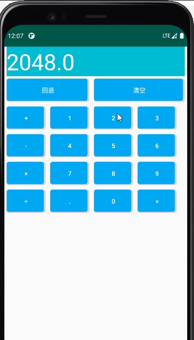
效果动态图
以上就是android xml实现按钮的圆角、阴影效果以及按下变化效果的详细内容,更多关于android按钮按下变化效果的资料请关注我们其它相关文章!
相关推荐
-

Android实现空心圆角矩形按钮的实例代码
页面上有时会用到背景为空心圆角矩形的Button,可以通过xml绘制出来. drawrable文件夹下bg_red_hollow_rectangle.xml <?xml version="1.0" encoding="utf-8"?> <shape xmlns:android="http://schemas.android.com/apk/res/android" android:shape="rectangle&qu
-
Android圆角按钮的制作方法
本文实例为大家分享了Android制作圆角按钮的具体代码,供大家参考,具体内容如下 [主要步骤] 创建一个XML文件 以此文件作为Button的Background 1.创建XML文件 在res目录下的drawable-mdpi下建立XML文件 button_frame_shape.xml <?xml version="1.0" encoding="utf-8"?> <shape xmlns:android="http://schemas
-
Android中给按钮同时设置背景和圆角示例代码
前言 最近在做按钮的时候遇到在给按钮设置一张图片作为背景的同时还要自己定义圆角,最简单的做法就是直接切张圆角图作为按钮就可以了,但是如果不这样该怎么办呢,看代码: 下面来看效果图 一.先建一个圆角的shape文件: <?xml version="1.0" encoding="utf-8"?> <shape xmlns:android="http://schemas.android.com/apk/res/android">
-
Android开发实现的圆角按钮、文字阴影按钮效果示例
本文实例讲述了Android开发实现的圆角按钮.文字阴影按钮效果.分享给大家供大家参考,具体如下: 效果图: 如果要实现圆角图片,并变色须在drawable中配置背景文件如下: <?xml version="1.0" encoding="utf-8"?> <selector xmlns:android="http://schemas.android.com/apk/res/android" > <item andro
-
Android中快速便捷的实现圆角按钮方法详解
前言 大家应该都知道,圆角按钮是我们在做界面时常常遇到的UI样式.通常的办法,是做一个drawable,比如这样: <?xml version="1.0" encoding="UTF-8"?> <shape xmlns:android="http://schemas.android.com/apk/res/android" android:shape="rectangle"> <!-- 填充的颜色
-
Android实现圆角Button按钮
本文实例讲述了Android开发圆角Button按钮实现过程,分享给大家供大家参考,具体内容如下 需求及效果图: 实现思路: 1.shape实现圆角 在drawable新建两个xml 文件, 这两个 xml文件用shape 实现了圆角效果. Note: 因为要让用户有按下去的效果体验, 所有要有两套圆角图, 在按下去时候切换 <!-- res/drawable/button_shape_normal.xml --> <shape xmlns:android="http://sc
-
android xml实现按钮的圆角、阴影效果及按下变化效果的实现代码
前言 5个xml文件实现 按钮的圆角.阴影效果以及按下变化效果 实现 drawable/shape.xml <?xml version="1.0" encoding="utf-8"?> <shape xmlns:android="http://schemas.android.com/apk/res/android" > <!-- 圆角 --> <corners android:radius="8
-
Android 进度条按钮ProgressButton的实现代码
有些App在点击下载按钮的时候,可以在按钮上显示进度,我们可以通过继承原生Button,重写onDraw来实现带进度条的按钮. Github:https://github.com/imcloudfloating/ProgressBar 1.效果: 2.原理: 创建三个GradientDrawable作为按钮背景.进度条背景和进度条前景,通过计算进度条的百分比来设置宽度,然后调用invalidate()重绘.GradientDrawable设置颜色.圆角等参数,当然你也可以直接加载xml作为背景.
-
Android利用悬浮按钮实现翻页效果
今天给大家分享下自己用悬浮按钮点击实现翻页效果的例子. 首先,一个按钮要实现悬浮,就要用到系统顶级窗口相关的WindowManager,WindowManager.LayoutParams.那么在AndroidManifest.xml中添加权限: <uses-permission android:name="android.permission.SYSTEM_ALERT_WINDOW" /> 然后,我们要对WindowManager,WindowManager.Layout
-
Android编程动态按钮实现方法
本文实例讲述了Android编程动态按钮实现方法.分享给大家供大家参考,具体如下: 第一种: 该方法通过onTouch来实现, btn3 = (ImageButton) findViewById(R.id.ImageButton03); btn3.setOnTouchListener(touchListener3); View.OnTouchListener touchListener = new OnTouchListener() { @Override public boolean onTo
-
Android开发基于Drawable实现圆角矩形的方法
本文实例讲述了Android开发基于Drawable实现圆角矩形的方法.分享给大家供大家参考,具体如下: 第一步:写个类继承drawable,重写里面的方法,实现的核心代码在draw里 关键技术:BitmapShader public BitmapShader(Bitmap bitmap,Shader.TileMode tileX,Shader.TileMode tileY) 调用这个方法来产生一个画有一个位图的渲染器(Shader). bitmap 在渲染器内使用的位图 tileX The t
-
Android ImageButton自定义按钮的按下效果的代码实现方法分享
使用Button时为了让用户有"按下"的效果,有两种实现方式:1.在代码里面. 复制代码 代码如下: imageButton.setOnTouchListener(new OnTouchListener(){ @Override public boolean onTouch(View v, MotionEvent event) { if(event.getAction()
-
基于Android实现转盘按钮代码
先给大家展示下效果图: package com.lixu.circlemenu; import android.app.Activity; import android.os.Bundle; import android.view.View; import android.widget.TextView; import android.widget.Toast; import com.lixu.circlemenu.view.CircleImageView; import com.lixu.ci
-
如何给Android中的按钮添加图片功能
在layout中建一个my_login.xml文件 代码如下 <?xml version="1.0" encoding="utf-8"?> <LinearLayout xmlns:Android="http://schemas.android.com/apk/res/android" android:layout_width="fill_parent" android:layout_height="
-
Android 带有删除按钮的EditText
MainActivity如下: package cc.textview5; import android.os.Bundle; import android.text.TextUtils; import android.view.View; import android.view.View.OnClickListener; import android.widget.Button; import android.widget.Toast; import android.app.Activity;