如何使用ant-design-vue的Table组件
目录
- 安装脚手架工具
- 使用Vue CLI新建项目
- $slots
- Table组件相关源码
安装脚手架工具
npm install -g @vue/cli
查看@vue/cli版本,vue -V。
使用Vue CLI新建项目
vue create antd-demo
下载ant-design-vue,ant-design-vue@2.1.6
npm install ant-design-vue@next --save
修改main.js,完整引入ant-design-vue所有组件及样式
import { createApp } from 'vue'
import App from './App.vue'
import Antd from "ant-design-vue";
import "ant-design-vue/dist/antd.css";
createApp(App).use(Antd).mount('#app')
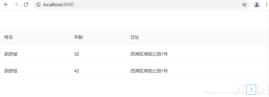
修改HelloWorld.vue,使用Antd的Table组件
<template>
  <a-table :dataSource="dataSource" :columns="columns" />
</template>
<script>
  export default {
    name:"Helloworld",
    setup() {
      return {
        dataSource: [
          {
            key: '1',
            name: '胡彦斌',
            age: 32,
            address: '西湖区湖底公园1号',
          },
          {
            key: '2',
            name: '胡彦祖',
            age: 42,
            address: '西湖区湖底公园1号',
          },
        ],
        columns: [
          {
            title: '姓名',
            dataIndex: 'name',
            key: 'name',
          },
          {
            title: '年龄',
            dataIndex: 'age',
            key: 'age',
          },
          {
            title: '住址',
            dataIndex: 'address',
            key: 'address',
          },
        ],
      };
    },
  };
</script>
:columns="columns",columns是一个数组,用于指定列头dataIndex值依次是:name、age和address,与dataSource每项的name、age和address对应。title,dataIndex值对应的列头名称name,对应的列头名称是姓名age,对应的列头名称是年龄address,对应的列头名称是地址
key,Vue需要的key,如果已经设置了唯一的dataIndex,可以忽略这个属性:dataSource=dataSource,指定数据源dataSource是一个数组- 每项的name、age和address,与columns里dataIndex的值:name、age和address相对应
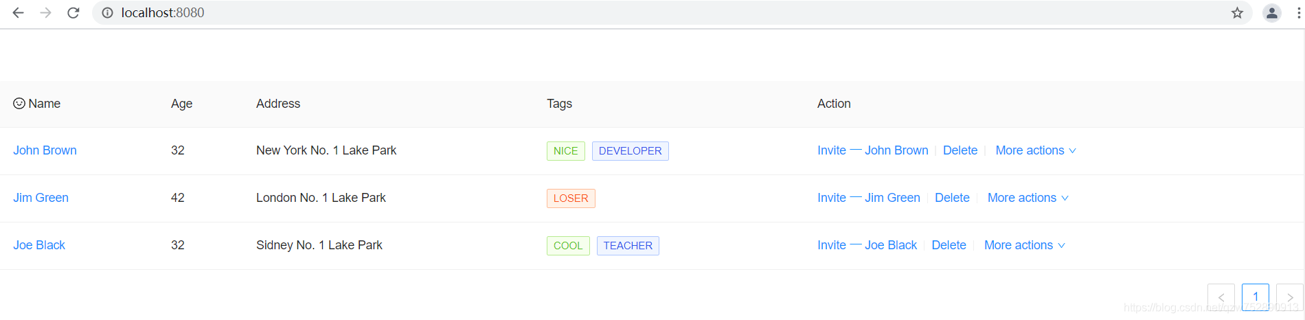
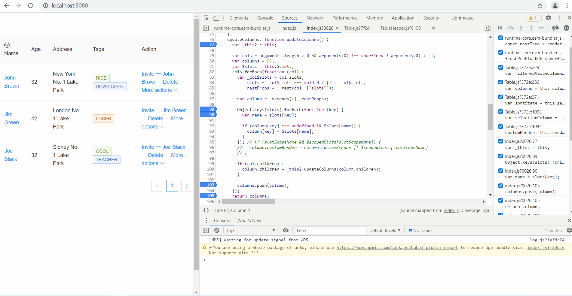
修改HelloWorld.vue,使用Antd的Table组件
<template>
  <a-table :columns="columns" :data-source="data">
    <template #name="{ text }">
      <a>{{ text }}</a>
    </template>
    <template #customTitle>
      <span>
        <smile-outlined />
        Name
      </span>
    </template>
    <template #tags="{ text: tags }">
      <span>
        <a-tag
          v-for="tag in tags"
          :key="tag"
          :color="tag === 'loser' ? 'volcano' : tag.length > 5 ? 'geekblue' : 'green'"
        >
          {{ tag.toUpperCase() }}
        </a-tag>
      </span>
    </template>
    <template #action="{ record }">
      <span>
        <a>Invite 一 {{ record.name }}</a>
        <a-divider type="vertical" />
        <a>Delete</a>
        <a-divider type="vertical" />
        <a class="ant-dropdown-link">
          More actions
          <down-outlined />
        </a>
      </span>
    </template>
  </a-table>
</template>
<script lang="ts">
import { SmileOutlined, DownOutlined } from '@ant-design/icons-vue';
import { defineComponent } from 'vue';
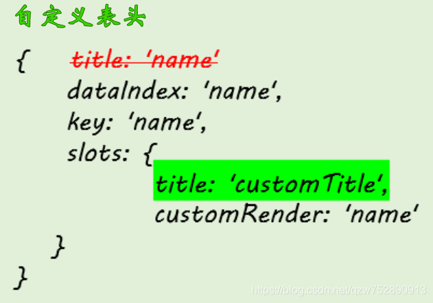
const columns = [
{
dataIndex: 'name',
key: 'name',
slots: { title: 'customTitle', customRender: 'name' },
},
{
title: 'Age',
dataIndex: 'age',
key: 'age',
},
{
title: 'Address',
dataIndex: 'address',
key: 'address',
},
{
title: 'Tags',
key: 'tags',
dataIndex: 'tags',
slots: { customRender: 'tags' },
},
{
title: 'Action',
key: 'action',
slots: { customRender: 'action' },
},
];
const data = [
{
key: '1',
name: 'John Brown',
age: 32,
address: 'New York No. 1 Lake Park',
tags: ['nice', 'developer'],
},
{
key: '2',
name: 'Jim Green',
age: 42,
address: 'London No. 1 Lake Park',
tags: ['loser'],
},
{
key: '3',
name: 'Joe Black',
age: 32,
address: 'Sidney No. 1 Lake Park',
tags: ['cool', 'teacher'],
},
];
export default defineComponent({
setup() {
return {
data,
columns,
};
},
components: {
SmileOutlined,
DownOutlined,
},
});
</script>
注意哈,ant-design-vue Table里:data-source与:dataSource是等效的。
要使用slots自定义样式,就有必要了解下Vue里的$slots和Table组件的源码。
$slots
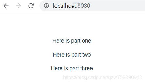
插槽内容可以在this.$slots中看到,举个例子。
组件base-layout
<template>
    <header>
        <slot name="header"></slot>
    </header>
    <main>
        <slot name="default"></slot>
    </main>
    <footer>
        <slot name="footer"></slot>
    </footer>
</template>
<script>
export default {
    name:"base-layout"
}
</script>
App.vue
<template>
  <BaseLayout>
    <template #header>
      <p>Here is part one</p>
    </template>
    <template #default>
      <p>Here is part two</p>
    </template>
    <template #footer>
      <p>Here is part three</p>
    </template>
  </BaseLayout>
</template>
<script>
import BaseLayout from "./components/base-layout.vue";
export default {
  name: 'App',
  components: {
    BaseLayout
  }
}
</script>
<style>
#app {
  font-family: Avenir, Helvetica, Arial, sans-serif;
  -webkit-font-smoothing: antialiased;
  -moz-osx-font-smoothing: grayscale;
  text-align: center;
  color: #2c3e50;
  margin-top: 60px;
}
</style>
main.js
import { createApp } from 'vue'
import App from './App.vue'
import Antd from "ant-design-vue";
import "ant-design-vue/dist/antd.css";
createApp(App).use(Antd).mount('#app');
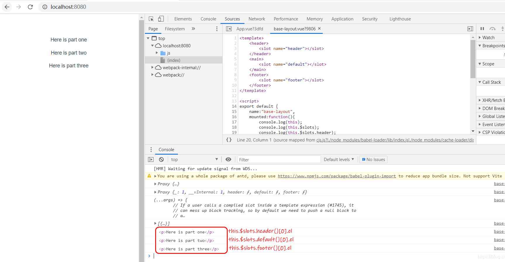
现在我们修改base-layout.vue,使用this.$slots来访问插槽内容。
<template>
    <header>
        <slot name="header"></slot>
    </header>
    <main>
        <slot name="default"></slot>
    </main>
    <footer>
        <slot name="footer"></slot>
    </footer>
</template>
<script>
export default {
    name:"base-layout",
    mounted:function(){
        console.log(this);
        console.log(this.$slots);
        console.log(this.$slots.header);
        console.log(this.$slots.header());
        console.log(this.$slots.header()[0].el);
        console.log(this.$slots.default()[0].el);
        console.log(this.$slots.footer()[0].el);
    }
}
</script>
Table组件相关源码
node_modules/ant-design-vue/es/table/index.js
updateColumns(cols = []) {
  const columns = [];
  const { $slots, $scopedSlots } = this;
  cols.forEach(col => {
    const { slots = {}, scopedSlots = {}, ...restProps } = col;
    const column = {
      ...restProps,
    };
    Object.keys(slots).forEach(key => {
      const name = slots[key];
      if (column[key] === undefined && $slots[name]) {
        column[key] = $slots[name].length === 1 ? $slots[name][0] : $slots[name];
      }
    });
    Object.keys(scopedSlots).forEach(key => {
      const name = scopedSlots[key];
      if (column[key] === undefined && $scopedSlots[name]) {
        column[key] = $scopedSlots[name];
      }
    });
    // if (slotScopeName && $scopedSlots[slotScopeName]) {
    //   column.customRender = column.customRender || $scopedSlots[slotScopeName]
    // }
    if (col.children) {
      column.children = this.updateColumns(column.children);
    }
    columns.push(column);
  });
  return columns;
}
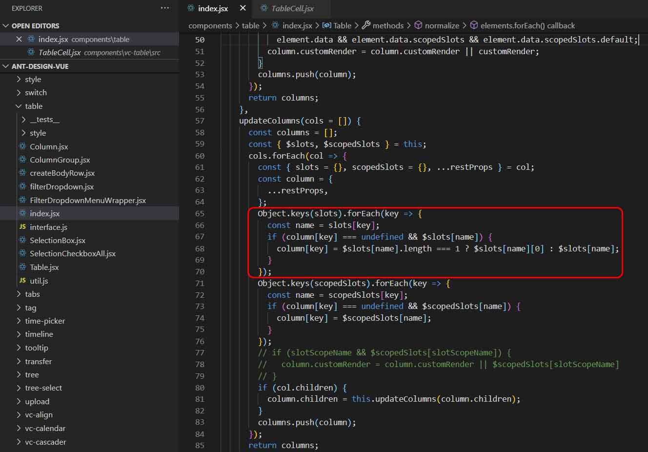

只有满足条件(column[key] === undefined && $slots[name]),才能使用作用域插槽来自定义表头。本例中,dataIndex:'name'想自定义表头,所以不能定义title属性,而是在slots属性中定义了title属性。
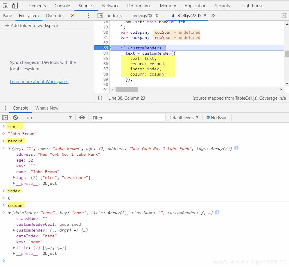
node_modules/ant-design-vue/es/vc-table/src/TableCell.js
render() {
  const {
    record,
    indentSize,
    prefixCls,
    indent,
    index,
    expandIcon,
    column,
    component: BodyCell,
  } = this;
  const { dataIndex, customRender, className = '' } = column;
  const { transformCellText } = this.table;
  // We should return undefined if no dataIndex is specified, but in order to
  // be compatible with object-path's behavior, we return the record object instead.
  let text;
  if (typeof dataIndex === 'number') {
    text = get(record, dataIndex);
  } else if (!dataIndex || dataIndex.length === 0) {
    text = record;
  } else {
    text = get(record, dataIndex);
  }
  let tdProps = {
    props: {},
    attrs: {},
    on: {
      click: this.handleClick,
    },
  };
  let colSpan;
  let rowSpan;
  if (customRender) {
    text = customRender(text, record, index, column);
    if (isInvalidRenderCellText(text)) {
      tdProps.attrs = text.attrs || {};
      tdProps.props = text.props || {};
      tdProps.class = text.class;
      tdProps.style = text.style;
      colSpan = tdProps.attrs.colSpan;
      rowSpan = tdProps.attrs.rowSpan;
      text = text.children;
    }
  }
  if (column.customCell) {
    tdProps = mergeProps(tdProps, column.customCell(record, index));
  }
  // Fix https://github.com/ant-design/ant-design/issues/1202
  if (isInvalidRenderCellText(text)) {
    text = null;
  }
  if (transformCellText) {
    text = transformCellText({ text, column, record, index });
  }
  const indentText = expandIcon ? (
    <span
      style={{ paddingLeft: `${indentSize * indent}px` }}
      class={`${prefixCls}-indent indent-level-${indent}`}
    />
  ) : null;
  if (rowSpan === 0 || colSpan === 0) {
    return null;
  }
  if (column.align) {
    tdProps.style = { textAlign: column.align, ...tdProps.style };
  }
  const cellClassName = classNames(className, column.class, {
    [`${prefixCls}-cell-ellipsis`]: !!column.ellipsis,
    // 如果有宽度,增加断行处理
    // https://github.com/ant-design/ant-design/issues/13825#issuecomment-449889241
    [`${prefixCls}-cell-break-word`]: !!column.width,
  });
  if (column.ellipsis) {
    if (typeof text === 'string') {
      tdProps.attrs.title = text;
    } else if (text) {
      // const { props: textProps } = text;
      // if (textProps && textProps.children && typeof textProps.children === 'string') {
      //   tdProps.attrs.title = textProps.children;
      // }
    }
  }
  return (
    <BodyCell class={cellClassName} {...tdProps}>
      {indentText}
      {expandIcon}
      {text}
    </BodyCell>
  );
}
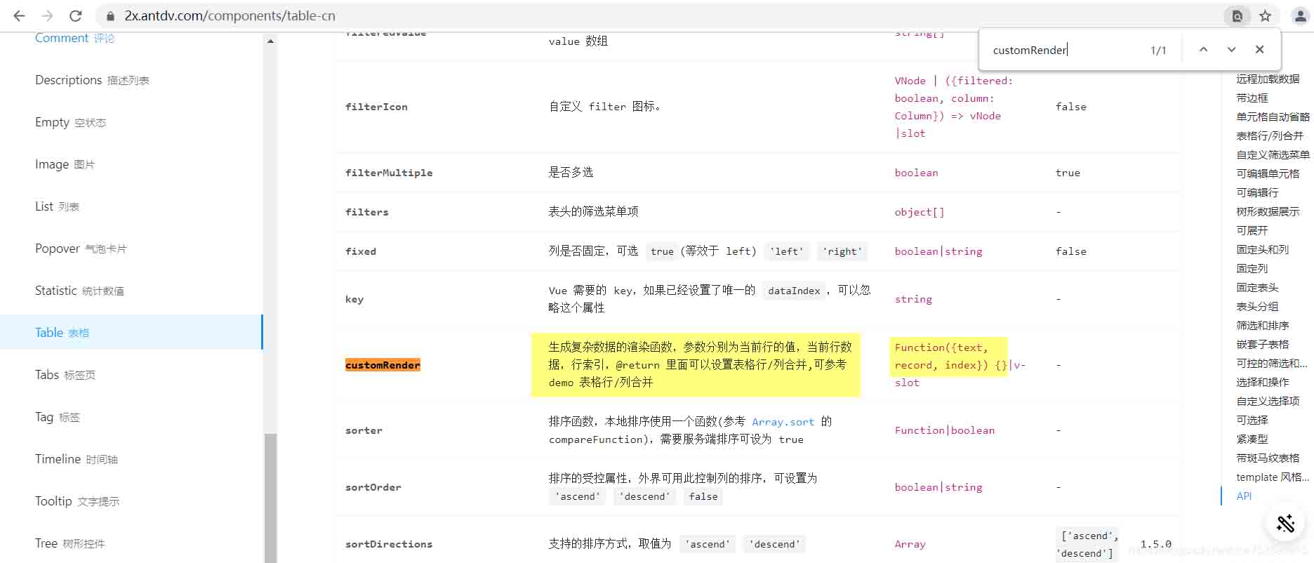
其中,customRender是渲染函数,用来对表中的值进行自定义渲染。该函数接受4个参数,分别是 text、 record、index和 column。
antd官网也有customRender的相关说明,如下
以上为个人经验,希望能给大家一个参考,也希望大家多多支持我们。
相关推荐
-
Ant Design of Vue select框获取key和name的问题
目录 Ant Design of Vue select框获取key和name 我的记录 Ant Design Vue使用select出现的问题 1.select下拉菜单滚动条滚动后,自动弹回到顶部 2.下拉列表在局部滚动时不跟随,与select框分离 Ant Design of Vue select框获取key和name 加入label-in-value这个属性 <a-form-item label="分类"> <a-select placeholder=
-

Ant Design 组件库按钮实现示例详解
目录 1 antd 之 Button API 2 antd 之 Button 示例 1 antd 之 Button API antd 组件库是基于 Ant Design 设计体系的 React UI 组件库,antd 为 Web 应用提供了丰富的基础 UI 组件,可以用于研发企业级中后台产品.这篇咱们介绍 antd 组件库之 按钮. 按钮 Button 是一个比较基础的 UI 组件,一般在有交互的应用中都会用到. 其 DOM 节点为 <Button>...</Button>,ant
-
Ant Design Vue 走马灯实现单页多张图片轮播效果
最近的项目有个需求是,这种单页多图一次滚动一张图片的轮播效果,项目组件库是antd 然而用了antd的走马灯是这样子的 我们可以看到官网给的api是没有这种功能,百度上也多是在css上动刀,那样也就毕竟繁琐了,我们是什么?我们是程序猿啊,程序猿就该有程序猿的样子,怎么能写繁琐的东西呢,那还怎么为公司项目提高效率!!!(我哪敢说是为了摸鱼啊) 为了追求摸鱼的真谛我仔细查阅了文档https://github.com/vueComponent/ant-design-vue/blob/master/co
-
ant design vue的form表单取值方法
目录 ant design vue的form表单取值 官方中有以下两种取值方式 ant design of vue 学习之表单form v-decorator(表单验证,内置绑定,初始值) 数据获取与填充 表单实例 ant design vue的form表单取值 官方中有以下两种取值方式 因为不是很熟悉,所以还是查了文档找了一下使用方式,刚开始查到的文档是这样写的 然后返回了undefined,后来又查询了一些文档,发现我多加了一个props属性,然后使用第二个方法成功了,代码如下: ant d
-
ant-design-pro 的EditableProTable表格验证调用的实现代码
博客源码https://github.com/shengbid/antdpro-demo,有需要可以下载下来看效果EditableProTable默认是在单行保存时调用表单验证 我这里的需求是点击外部的保存要对整个表单进行验证 EditableProTable提供了editable属性,可以设置form https://procomponents.ant.design/components/editable-table 代码 import React, { useState, useEffect
-
关于Ant-Design-Vue快速上手指南+排坑
目录 前言 NO.1 表单组件 如何自定义表单校验规则 表单回显 提交表单 NO.2 表格(Table) NO.3 Spin组件 打包优化 结语 前言 公司要开发一个后台管理系统,对于UI库的选择上选择了颜值爆表的Ant-Design-Vue作为整个项目UI库,但谁曾想,暗中的坑一个接一个,文档也不怎么详细,可能习惯了element-ui的掘友们也许不怎么好适应,本文就带大家一起学习如何高效使用Ant-Design-Vue. NO.1 表单组件 首先就来说说最常用的Form组件的正确使用姿势:
-
Ant Design 组件库之步骤条实现
目录 引言 1 antd 之 Steps API 2 antd 之 Steps 示例 引言 antd 组件库是基于 Ant Design 设计体系的 React UI 组件库,antd 为 Web 应用提供了丰富的基础 UI 组件,可以用于研发企业级中后台产品.这篇咱们介绍 antd 组件库之 步骤条. 1 antd 之 Steps API 步骤条 Steps 的用处是在 当任务复杂或者存在先后关系时,将其分解成一系列的步骤,从而达到简化任务的目的.其 DOM 节点为 : <Steps> &l
-
ant design vue的table取消自带分页问题
目录 ant design vue的table取消自带分页 题外话: ant design vue table分页 ant design vue table分页设置 ant design vue的table取消自带分页 在我们使用ant design vue的table组件的时候会发现: 组件使用如示: <a-table :columns="columns" :data-source="data" bordered></a-table> 显然
-
ant design vue 表格table 默认勾选几项的操作
为什么我同样的功能要用react .vue 都写一遍 ? 啊我真是不是闲的蛋疼啊(- o -)~zZ 在 ant design vue 中,表格的第一列是联动的选择框 截一张官方文档图,图示最后一排就是禁用状态 点击 checkbox 会触发onChange , 从而得到selectedRowKeys,selectedRowKeys就是选中的 key 数组. onChange: (selectedRowKeys, selectedRows) => { console.log(`selectedR
-
Vue中Table组件行内右键菜单实现方法(基于 vue + AntDesign)
最近做的一个项目是基于 vue + AntDesign 的.由于项目要求,需要在 Table 组件的行内点右键的时候弹出菜单.在线演示地址及最终效果图如下: 在线演示地址>> 首先新建一个Table组件的实例: <a-table :columns="columns" :rowKey="record => { return record.INDEX;}" :dataSource="tableData" /> ... c
-
Ant Design Vue中的table与pagination的联合使用方式
目录 Ant Design Vue中table与pagination联合使用 ant.design.vue中table的使用说明 table的创建 table之columns table之dataSource table之loading table之scroll table之rowKey table之rowSelection table之customRow table之change Ant Design Vue中table与pagination联合使用 表格table使用链接:ant desig
-
Vue3(二)集成Ant Design Vue
目录 一.集成Ant Design Vue 二.组件的使用 1.完整引用 2.组件引用 三.组件使用示例 1.我们在home主页做修改 2.重新启动服务查看效果 四.总结 上一篇文章我们介绍了利用Vue3 创建Vue CLI 项目(一)接下来承接上一篇文章的基础继续展开下面文章的内容 一.集成Ant Design Vue SQL: npm install ant-design-vue@2.0.0-rc.3 --save 兼容性: Ant Design Vue 2.x 支持所有的现代浏览器. 如果
-
Ant design vue table 单击行选中 勾选checkbox教程
最近了解Ant design 设计table 单击行选中checkedbox功能,相比于element的 @row-click 再触发toggleRowSelection,ant design的api就没那么清晰了,言归正传 期望:Ant design table 单击行选中 勾选checkedbox 实现: 单选: onClickRow(record) { return { on: { click: () => { let keys = []; keys.push(record.id); th
-
Ant Design Vue table中列超长显示...并加提示语的实例
我就废话不多说了,大家还是直接看代码吧~ <template> <a-row class="a-left"> <a-row> <p class="a-title">今日考勤状况</p> <a-row type="flex" justify="space-around"> <a-col :span="4" class="b
-
ant design vue嵌套表格及表格内部编辑的用法说明
实现效果: 因为pro手脚架中封装的s-table不支持expand和expandedRowsChange事件,无法实现根据展开节点获取其内部数据的需求,因此直接使用a-table组件 表格外层可以翻页,查询携带页码参数 <a-table size="default" rowKey="dict_id" //根据自己数据内部关键针设定 ref="table" @expandedRowsChange="expandedRowsChan
-
解决ant design vue 表格a-table二次封装,slots渲染的问题
目的就是对a-table进行二次封装,但是在如何显示a-table的slot时遇到了问题,原本想法是在a-table内把$slots都渲染,期望在使用该组件时能正确渲染,然而...并不会正确渲染 <template> <a-table bordered :scroll="{ x: scrollX, y: 600 }" v-bind="{...$attrs, ...$props, ...{dataSource: body, columns: header}}&
-
ant design vue导航菜单与路由配置操作
此功能包含: 1.根据动态路由自动展开与自动选择对应路由所在页面菜单 2.只展开一个子菜单 3.兄弟组件控制菜单与路由 <a-menu :openKeys="openKeys" :selectedKeys="selectedKeys" mode="inline" theme="dark" :inlineCollapsed="$store.state.isCollapse" @click='select