Python中的数据可视化matplotlib与绘图库模块
目录
- 一、条形图bar()
- 二、直方图
- 三、折线图
- 四、散点图+直线图
- 五、饼图
- 六、箱型图
- 七、plot函数参数
- 八、图像标注参数
- 九、Matplolib应用
matplotlib官方文档:https://matplotlib.org/stable/users/index.html
matplotlib是一个绘图库,它可以创建常用的统计图,包括条形图、箱型图、折线图、散点图、饼图和直方图。
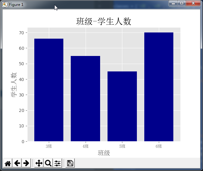
一、条形图bar()
import matplotlib.pyplot as plt
from matplotlib.font_manager import FontProperties
font = FontProperties(fname=r'c:\windows\fonts\simsun.ttc')

# 修改背景为条纹
plt.style.use('ggplot')

classes = ['3班', '4班', '5班', '6班']

classes_index = range(len(classes))
print(list(classes_index))
# [0, 1, 2, 3]

student_amounts = [66, 55, 45, 70]

# 画布设置
fig = plt.figure()
# 1,1,1表示一张画布切割成1行1列共一张图的第1个;2,2,1表示一张画布切割成2行2列共4张图的第一个(左上角)
ax1 = fig.add_subplot(1, 1, 1)
ax1.bar(classes_index, student_amounts, align='center', color='darkblue')
ax1.xaxis.set_ticks_position('bottom')
ax1.yaxis.set_ticks_position('left')

plt.xticks(classes_index,
           classes,
           rotation=0,
           fontsize=13,
           fontproperties=font)
plt.xlabel('班级', fontproperties=font, fontsize=15)
plt.ylabel('学生人数', fontproperties=font, fontsize=15)
plt.title('班级-学生人数', fontproperties=font, fontsize=20)
# 保存图片,bbox_inches='tight'去掉图形四周的空白
# plt.savefig('classes_students.png', dpi=400, bbox_inches='tight')
plt.show()
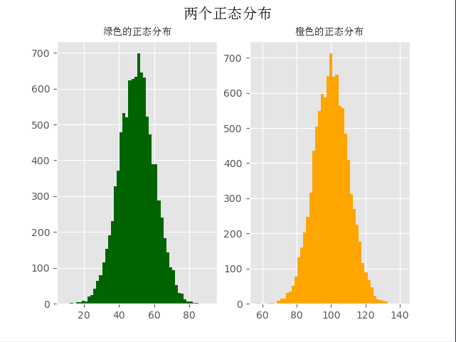
二、直方图
import numpy as np
import matplotlib.pyplot as plt
from matplotlib.font_manager import FontProperties
font = FontProperties(fname=r'c:\windows\fonts\simsun.ttc')

# 修改背景为条纹
plt.style.use('ggplot')
mu1, mu2, sigma = 50, 100, 10

# 构造均值为50的符合正态分布的数据
x1 = mu1 + sigma * np.random.randn(10000)
print(x1)
# [59.00855949 43.16272141 48.77109774 ... 57.94645859 54.70312714
#  58.94125528]

# 构造均值为100的符合正态分布的数据
x2 = mu2 + sigma * np.random.randn(10000)
print(x2)
# [115.19915511  82.09208214 110.88092454 ...  95.0872103  104.21549068
#  133.36025251]

fig = plt.figure()
ax1 = fig.add_subplot(121)
# bins=50表示每个变量的值分成50份,即会有50根柱子
ax1.hist(x1, bins=50, color='darkgreen')

ax2 = fig.add_subplot(122)
ax2.hist(x2, bins=50, color='orange')

fig.suptitle('两个正态分布', fontproperties=font, fontweight='bold', fontsize=15)
ax1.set_title('绿色的正态分布', fontproperties=font)
ax2.set_title('橙色的正态分布', fontproperties=font)
plt.show()
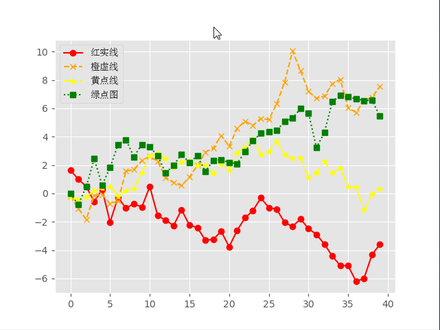
三、折线图
import numpy as np
from numpy.random import randn
import matplotlib.pyplot as plt
from matplotlib.font_manager import FontProperties
font = FontProperties(fname=r'c:\windows\fonts\simsun.ttc')

# 修改背景为条纹
plt.style.use('ggplot')

np.random.seed(1)

# 使用numpy的累加和,保证数据取值范围不会在(0,1)内波动
plot_data1 = randn(40).cumsum()
print(plot_data1)
# [ 1.62434536  1.01258895  0.4844172  -0.58855142  0.2768562  -2.02468249
#  -0.27987073 -1.04107763 -0.72203853 -0.97140891  0.49069903 -1.56944168
#  -1.89185888 -2.27591324 -1.1421438  -2.24203506 -2.41446327 -3.29232169
#  -3.25010794 -2.66729273 -3.76791191 -2.6231882  -1.72159748 -1.21910314
#  -0.31824719 -1.00197505 -1.12486527 -2.06063471 -2.32852279 -1.79816732
#  -2.48982807 -2.8865816  -3.5737543  -4.41895994 -5.09020607 -5.10287067
#  -6.22018102 -5.98576532 -4.32596314 -3.58391898]

plot_data2 = randn(40).cumsum()
plot_data3 = randn(40).cumsum()
plot_data4 = randn(40).cumsum()

plt.plot(plot_data1, marker='o', color='red', linestyle='-', label='红实线')
plt.plot(plot_data2, marker='x', color='orange', linestyle='--', label='橙虚线')
plt.plot(plot_data3, marker='*', color='yellow', linestyle='-.', label='黄点线')
plt.plot(plot_data4, marker='s', color='green', linestyle=':', label='绿点图')

# loc='best'给label自动选择最好的位置
plt.legend(loc='best', prop=font)
plt.show()
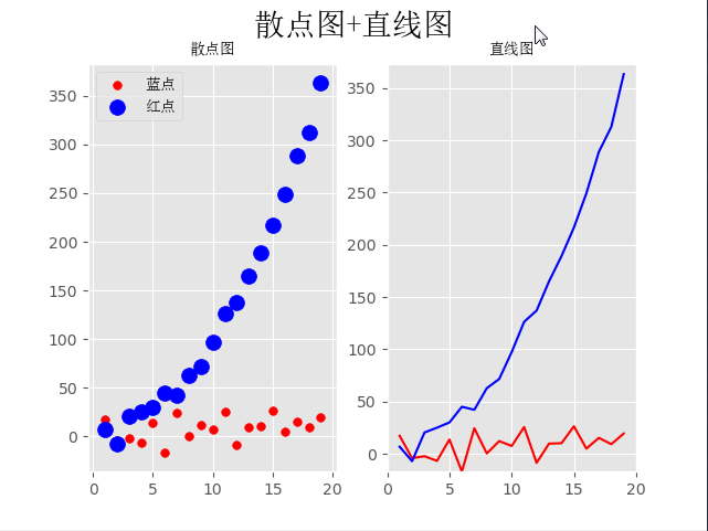
四、散点图+直线图
import numpy as np
from numpy.random import randn
import matplotlib.pyplot as plt
from matplotlib.font_manager import FontProperties
font = FontProperties(fname=r'c:\windows\fonts\simsun.ttc')

# 修改背景为条纹
plt.style.use('ggplot')

x = np.arange(1, 20, 1)
print(x)
# [ 1  2  3  4  5  6  7  8  9 10 11 12 13 14 15 16 17 18 19]

# 拟合一条水平散点线
np.random.seed(1)
y_linear = x + 10 * np.random.randn(19)
# print(y_linear)
# [ 17.24345364  -4.11756414  -2.28171752  -6.72968622  13.65407629
#  -17.01538697  24.44811764   0.38793099  12.19039096   7.50629625
#   25.62107937  -8.60140709   9.77582796  10.15945645  26.33769442
#    5.00108733  15.27571792   9.22141582  19.42213747]

# 拟合一条x²的散点线
y_quad = x**2 + 10 * np.random.randn(19)
print(y_quad)
# [  6.82815214  -7.00619177  20.4472371   25.01590721  30.02494339
#   45.00855949  42.16272141  62.77109774  71.64230566  97.3211192
#  126.30355467 137.08339248 165.03246473 189.128273   216.54794359
#  249.28753869 288.87335401 312.82689651 363.34415698]

# s是散点大小
fig = plt.figure()
ax1 = fig.add_subplot(121)
plt.scatter(x, y_linear, s=30, color='r', label='蓝点')
plt.scatter(x, y_quad, s=100, color='b', label='红点')

ax2 = fig.add_subplot(122)
plt.plot(x, y_linear, color='r')
plt.plot(x, y_quad, color='b')

# 限制x轴和y轴的范围取值
plt.xlim(min(x) - 1, max(x) + 1)
plt.ylim(min(y_quad) - 10, max(y_quad) + 10)
fig.suptitle('散点图+直线图', fontproperties=font, fontsize=20)
ax1.set_title('散点图', fontproperties=font)
ax1.legend(prop=font)
ax2.set_title('直线图', fontproperties=font)
plt.show()
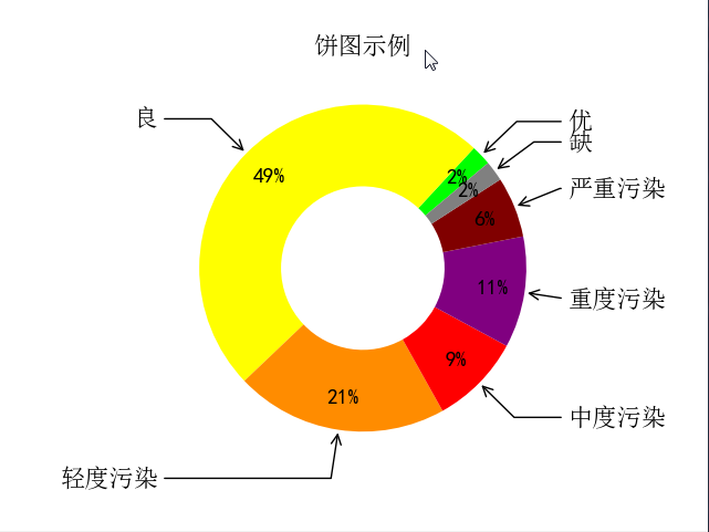
五、饼图
import numpy as np
import matplotlib.pyplot as plt
from pylab import mpl
from matplotlib.font_manager import FontProperties
font = FontProperties(fname=r'c:\windows\fonts\simsun.ttc')

mpl.rcParams['font.sans-serif'] = ['SimHei']

fig, ax = plt.subplots(subplot_kw=dict(aspect="equal"))

recipe = ['优', '良', '轻度污染', '中度污染', '重度污染', '严重污染', '缺']

data = [2, 49, 21, 9, 11, 6, 2]
colors = ['lime', 'yellow', 'darkorange', 'red', 'purple', 'maroon', 'grey']
wedges, texts, texts2 = ax.pie(data,
                               wedgeprops=dict(width=0.5),
                               startangle=40,
                               colors=colors,
                               autopct='%1.0f%%',
                               pctdistance=0.8)
plt.setp(texts2, size=14, weight="bold")

bbox_props = dict(boxstyle="square,pad=0.3", fc="w", ec="k", lw=0.72)
kw = dict(xycoords='data',
          textcoords='data',
          arrowprops=dict(arrowstyle="->"),
          bbox=None,
          zorder=0,
          va="center")

for i, p in enumerate(wedges):
    ang = (p.theta2 - p.theta1) / 2. + p.theta1
    y = np.sin(np.deg2rad(ang))
    x = np.cos(np.deg2rad(ang))
    horizontalalignment = {-1: "right", 1: "left"}[int(np.sign(x))]
    connectionstyle = "angle,angleA=0,angleB={}".format(ang)
    kw["arrowprops"].update({"connectionstyle": connectionstyle})
    ax.annotate(recipe[i],
                xy=(x, y),
                xytext=(1.25 * np.sign(x), 1.3 * y),
                size=16,
                horizontalalignment=horizontalalignment,
                fontproperties=font,
                **kw)

ax.set_title("饼图示例", fontproperties=font)

plt.show()
# plt.savefig('jiaopie2.png')
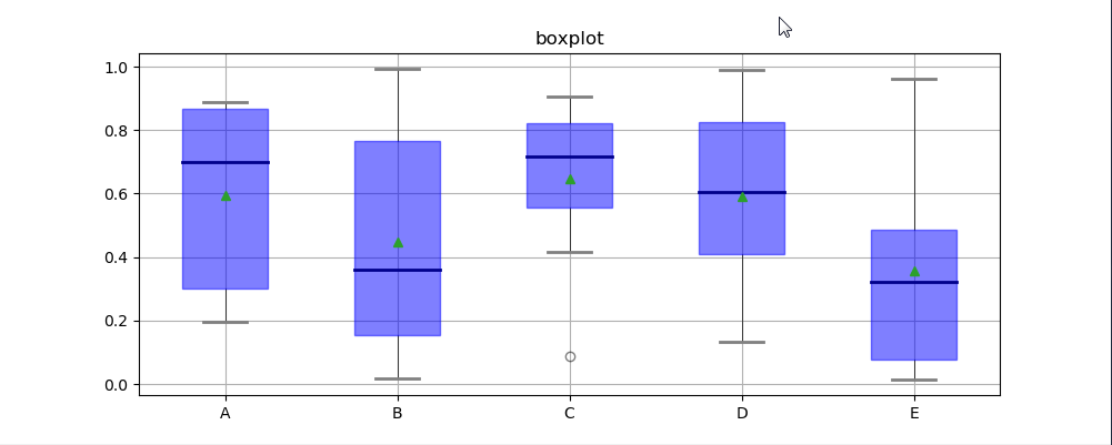
六、箱型图
箱型图:又称为盒须图、盒式图、盒状图或箱线图,是一种用作显示一组数据分散情况资料的统计图(在数据分析中常用在异常值检测)
包含一组数据的:最大值、最小值、中位数、上四分位数(Q3)、下四分位数(Q1)、异常值
- 中位数 →一组数据平均分成两份,中间的数
- 上四分位数Q1 →是将序列平均分成四份,计算(n+1)/4与(n-1)/4两种,一般使用(n+1)/4
- 下四分位数Q3 →是将序列平均分成四份,计算(1+n)/4*3=6.75
- 内限 →T形的盒须就是内限,最大值区间Q3+1.5IQR,最小值区间Q1-1.5IQR (IQR=Q3-Q1)
- 外限 →T形的盒须就是内限,最大值区间Q3+3IQR,最小值区间Q1-3IQR (IQR=Q3-Q1)
- 异常值 →内限之外 - 中度异常,外限之外 - 极度异常
import numpy as np
import matplotlib.pyplot as plt
import pandas as pd
from matplotlib.font_manager import FontProperties
font = FontProperties(fname=r'c:\windows\fonts\simsun.ttc')
df = pd.DataFrame(np.random.rand(10, 5), columns=['A', 'B', 'C', 'D', 'E'])
plt.figure(figsize=(10, 4))
# 创建图表、数据

f = df.boxplot(
    sym='o',  # 异常点形状,参考marker
    vert=True,  # 是否垂直
    whis=1.5,  # IQR,默认1.5,也可以设置区间比如[5,95],代表强制上下边缘为数据95%和5%位置
    patch_artist=True,  # 上下四分位框内是否填充,True为填充
    meanline=False,
    showmeans=True,  # 是否有均值线及其形状
    showbox=True,  # 是否显示箱线
    showcaps=True,  # 是否显示边缘线
    showfliers=True,  # 是否显示异常值
    notch=False,  # 中间箱体是否缺口
    return_type='dict'  # 返回类型为字典
)
plt.title('boxplot')

for box in f['boxes']:
    box.set(color='b', linewidth=1)  # 箱体边框颜色
    box.set(facecolor='b', alpha=0.5)  # 箱体内部填充颜色
for whisker in f['whiskers']:
    whisker.set(color='k', linewidth=0.5, linestyle='-')
for cap in f['caps']:
    cap.set(color='gray', linewidth=2)
for median in f['medians']:
    median.set(color='DarkBlue', linewidth=2)
for flier in f['fliers']:
    flier.set(marker='o', color='y', alpha=0.5)
# boxes, 箱线
# medians, 中位值的横线,
# whiskers, 从box到error bar之间的竖线.
# fliers, 异常值
# caps, error bar横线
# means, 均值的横线
plt.show()
七、plot函数参数
- 线型linestyle(-,-.,--,..)
- 点型marker(v,^,s,*,H,+,x,D,o,…)
- 颜色color(b,g,r,y,k,w,…)
八、图像标注参数
- 设置图像标题:plt.title()
- 设置x轴名称:plt.xlabel()
- 设置y轴名称:plt.ylabel()
- 设置X轴范围:plt.xlim()
- 设置Y轴范围:plt.ylim()
- 设置X轴刻度:plt.xticks()
- 设置Y轴刻度:plt.yticks()
- 设置曲线图例:plt.legend()
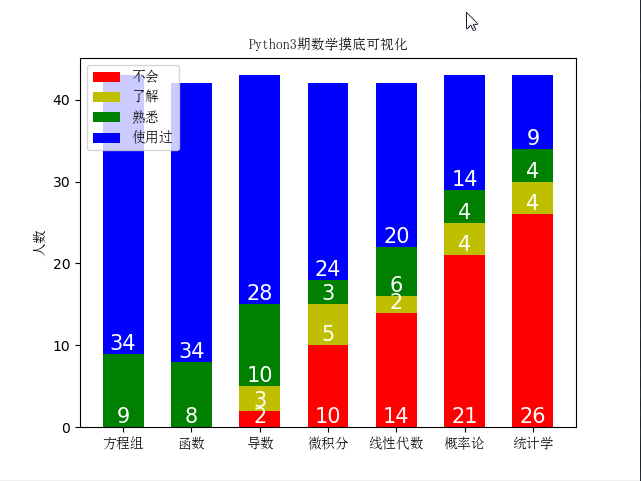
九、Matplolib应用
import pandas as pd
import matplotlib.pyplot as plt
from matplotlib.font_manager import FontProperties
font = FontProperties(fname=r'c:\windows\fonts\simsun.ttc')

header_list = ['方程组', '函数', '导数', '微积分', '线性代数', '概率论', '统计学']
py3_df = pd.read_excel('py3.xlsx', header=None,   skiprows=[0, 1], names=header_list)
# 处理带有NaN的行
py3_df = py3_df.dropna(axis=0) #
print(py3_df)

# 自定义映射
map_dict = {
    '不会': 0,
    '了解': 1,
    '熟悉': 2,
    '使用过': 3,
}

for header in header_list:
    py3_df[header] = py3_df[header].map(map_dict)

unable_series = (py3_df == 0).sum(axis=0)
know_series = (py3_df == 1).sum(axis=0)
familiar_series = (py3_df == 2).sum(axis=0)
use_series = (py3_df == 3).sum(axis=0)

unable_label = '不会'
know_label = '了解'
familiar_label = '熟悉'
use_label = '使用过'
for i in range(len(header_list)):
    bottom = 0

    # 描绘不会的条形图
    plt.bar(x=header_list[i], height=unable_series[i],  width=0.60, color='r', label=unable_label)
    if unable_series[i] != 0:
        plt.text(header_list[i], bottom, s=unable_series[i],   ha='center', va='bottom', fontsize=15, color='white')
    bottom += unable_series[i]

    # 描绘了解的条形图
    plt.bar(x=header_list[i], height=know_series[i],  width=0.60, color='y', bottom=bottom, label=know_label)
    if know_series[i] != 0:
        plt.text(header_list[i], bottom, s=know_series[i],  ha='center', va='bottom', fontsize=15, color='white')
    bottom += know_series[i]

    # 描绘熟悉的条形图
    plt.bar(x=header_list[i], height=familiar_series[i],    width=0.60, color='g', bottom=bottom, label=familiar_label)
    if familiar_series[i] != 0:
        plt.text(header_list[i], bottom, s=familiar_series[i], ha='center', va='bottom', fontsize=15, color='white')
    bottom += familiar_series[i]

    # 描绘使用过的条形图
    plt.bar(x=header_list[i], height=use_series[i],  width=0.60, color='b', bottom=bottom, label=use_label)
    if use_series[i] != 0:
        plt.text(header_list[i], bottom, s=use_series[i], ha='center', va='bottom', fontsize=15, color='white')

    unable_label = know_label = familiar_label = use_label = ''

plt.xticks(header_list, fontproperties=font)
plt.ylabel('人数', fontproperties=font)
plt.title('Python3期数学摸底可视化', fontproperties=font)
plt.legend(prop=font, loc='upper left')
plt.show()
    方程组   函数   导数        微积分       线性代数  概率论  统计学
0   使用过  使用过   不会         不会         不会   不会   不会
1   使用过  使用过   了解         不会         不会   不会   不会
2   使用过  使用过   熟悉         不会         不会   不会   不会
3    熟悉   熟悉   熟悉         了解         了解   了解   了解
4   使用过  使用过  使用过        使用过        使用过  使用过  使用过
5   使用过  使用过  使用过         不会         不会   不会   了解
6    熟悉   熟悉   熟悉         熟悉         熟悉   熟悉   不会
7   使用过  使用过  使用过        使用过        使用过  使用过  使用过
8    熟悉   熟悉   熟悉         熟悉         熟悉  使用过  使用过
9    熟悉   熟悉  使用过         不会        使用过  使用过   不会
10  使用过  使用过   熟悉         熟悉         熟悉   熟悉   熟悉
11  使用过  使用过  使用过        使用过        使用过   不会   不会
12  使用过  使用过  使用过        使用过        使用过  使用过  使用过
13  使用过  使用过   了解         不会         不会   不会   不会
14  使用过  使用过  使用过        使用过        使用过   不会   不会
15  使用过  使用过   熟悉         不会         不会   不会   不会
16   熟悉   熟悉  使用过        使用过        使用过   不会   不会
17  使用过  使用过  使用过         了解         不会   不会   不会
18  使用过  使用过  使用过        使用过         熟悉   熟悉   熟悉
19  使用过  使用过  使用过         了解         不会   不会   不会
20  使用过  使用过  使用过        使用过        使用过  使用过  使用过
21  使用过  使用过  使用过        使用过        使用过  使用过  使用过
22  使用过  很了解   熟悉  了解一点,不会运用  了解一点,不会运用   了解   不会
23  使用过  使用过  使用过        使用过         熟悉  使用过   熟悉
24   熟悉   熟悉   熟悉        使用过         不会   不会   不会
25  使用过  使用过  使用过        使用过        使用过  使用过  使用过
26  使用过  使用过  使用过        使用过        使用过   不会   不会
27  使用过  使用过   不会         不会         不会   不会   不会
28  使用过  使用过  使用过        使用过        使用过  使用过   了解
29  使用过  使用过  使用过        使用过        使用过   了解   不会
30  使用过  使用过  使用过        使用过        使用过   不会   不会
31  使用过  使用过  使用过        使用过         不会  使用过  使用过
32   熟悉   熟悉  使用过        使用过        使用过   不会   不会
33  使用过  使用过  使用过        使用过         熟悉  使用过   熟悉
34   熟悉   熟悉   熟悉        使用过        使用过   熟悉   不会
35  使用过  使用过  使用过        使用过        使用过  使用过  使用过
36  使用过  使用过  使用过        使用过        使用过  使用过   了解
37  使用过  使用过  使用过        使用过        使用过   不会   不会
38  使用过  使用过  使用过         不会         不会   不会   不会
39  使用过  使用过   不会         不会         不会   不会   不会
40  使用过  使用过  使用过        使用过        使用过   不会   不会
41  使用过  使用过   熟悉         了解         了解   了解   不会
42  使用过  使用过  使用过         不会         不会   不会   不会
43   熟悉  使用过   了解         了解         不会   不会   不会
到此这篇关于Python中数据可视化matplotlib与绘图库模块的文章就介绍到这了。希望对大家的学习有所帮助,也希望大家多多支持我们。
相关推荐
-

Python数据可视化之matplotlib.pyplot绘图的基本参数详解
目录 1.matplotlib简介 2.图形组成元素的函数用法 2.1. figure():背景颜色 2.2 xlim()和 ylim():设置 x,y 轴的数值显示范围 2.3 xlabel()和 ylabel():设置 x,y 轴的标签文本 2.4 grid():绘制刻度线的网格线 2.5 axhline():绘制平行于 x 轴额度水平参考线 2.6 axvspan():绘制垂直于 x 轴的参考区域 2.7 xticks(),yticks() 2.8 annotate():添加图形内容细节的
-
python Matplotlib数据可视化(1):简单入门
1 matplot入门指南 matplotlib是Python科学计算中使用最多的一个可视化库,功能丰富,提供了非常多的可视化方案,基本能够满足各种场景下的数据可视化需求.但功能丰富从另一方面来说也意味着概念.方法.参数繁多,让许多新手望而却步. 据我了解,大部分人在对matplotlib接触不深时都是边画图边百度,诸如这类的问题,我想大家都似曾相识:Python如何画散点图,matplotlib怎么将坐标轴标签旋转45度,怎么设置图例字体大小等等.无论针对哪一个问题,往往都有多种解决方法,搜索
-
基于Python数据可视化利器Matplotlib,绘图入门篇,Pyplot详解
Pyplot matplotlib.pyplot是一个命令型函数集合,它可以让我们像使用MATLAB一样使用matplotlib.pyplot中的每一个函数都会对画布图像作出相应的改变,如创建画布.在画布中创建一个绘图区.在绘图区上画几条线.给图像添加文字说明等.下面我们就通过实例代码来领略一下他的魅力. import matplotlib.pyplot as plt plt.plot([1,2,3,4]) plt.ylabel('some numbers') plt.show() 上图是我们通
-
Python数据可视化之用Matplotlib绘制常用图形
一.散点图 散点图用两组数据构成多个坐标点,考察坐标点的分布,判断两变量之间是否存在某种关联或总结坐标点的分布模式. 特点:判断变量之间是否存在数量关联趋势,表示离群点的分布规律. 散点图绘制: plt.scatter(x,y) # 以默认的形状颜色绘制散点图 实例: 假设我们获取到了上海2020年5,10月份每天白天的最高气温(分别位于列表a.b),那么此时如何观察气温和随时间变化的某种规律. # 绘制图形所需的数据 y_5 = [11,17,16,11,12,11,12,13,10,14,8
-
通过python的matplotlib包将Tensorflow数据进行可视化的方法
使用matplotlib中的一些函数将tensorflow中的数据可视化,更加便于分析 import tensorflow as tf import numpy as np import matplotlib.pyplot as plt def add_layer(inputs, in_size, out_size, activation_function=None): Weights = tf.Variable(tf.random_normal([in_size, out_size])) bi
-
python Matplotlib数据可视化(2):详解三大容器对象与常用设置
上一篇博客中说到,matplotlib中所有画图元素(artist)分为两类:基本型和容器型.容器型元素包括三种:figure.axes.axis.一次画图的必经流程就是先创建好figure实例,接着由figure去创建一个或者多个axes,然后通过axes实例调用各种方法来添加各种基本型元素,最后通过axes实例本身的各种方法亦或者通过axes获取axis实例实现对各种元素的细节操控. 本篇博客继续上一节的内容,展开介绍三大容器元素创建即通过三大容器可以完成的常用设置. 1 figure 1.
-
Python数据可视化教程之Matplotlib实现各种图表实例
前言 数据分析就是将数据以各种图表的形式展现给领导,供领导做决策用,因此熟练掌握饼图.柱状图.线图等图表制作是一个数据分析师必备的技能.Python有两个比较出色的图表制作框架,分别是Matplotlib和Pyechart.本文主要讲述使用Matplotlib制作各种数据图表. Matplotlib是最流行的用于绘制2D数据图表的Python库,能够在各种平台上使用,可以绘制散点图.柱状图.饼图等. 1.柱状图 是一种以长方形或长方体的高度为变量的表达图形的统计报告图,由一系列高度不等的纵向条纹
-
Python数据可视化之使用matplotlib绘制简单图表
目录 一.绘制折线图 二.绘制柱形图或堆积图形 三.绘制条形图或堆积条形图 四.绘制堆积面积图 五.绘制直方图 六.绘制饼图或者圆环图 七.绘制散点图或气泡图 八.绘制箱形图 九.绘制雷达图 十.绘制误差棒图 总结 一.绘制折线图 使用plot()绘制折线图 常用的参数: x:表示x轴的数据 y:表示y轴的数据 fmt:表示快速设置条样式的格式字符串. label:表示应用于图例的标签文本. plot()会返回一个包含Line2D类对象(代表线条)的列表. plot()函数的语法格式: plot
-
python数据可视化之matplotlib.pyplot基础以及折线图
不论是数据挖掘还是数据建模,都免不了数据可视化的问题.对于Python来说,Matplotlib是最著名的绘图库,它主要用于二维绘图,当然它也可以进行简单的三维绘图(基于spyder). - 模块引用 import matplotlib.pyplot as plt #引用画图库中的pyplot模块 -折线条图 语法 import matplotlib.pyplot as plt data=[1,2,3,4,5,4,2,4,6,7] #随便创建了一个数据 plt.plot(data) #引用画图库
-
Python 数据可视化之Matplotlib详解
目录 使用的数据库 tips 数据库 Matplotlib 散点图 折线图 条形图 直方图 总结 在深入研究这些库之前,首先,我们需要一个数据库来绘制数据.我们将在本完整教程中使用 tips database.让我们讨论一下这个数据库的简介. 使用的数据库 tips 数据库 tips 数据库是20世纪90年代初期顾客在餐厅的两个半月的小费记录.它包含 6 列,例如 total_bill.tip.sex.smoker.day.time.size. 您可以从这里下载 tips 数据库. 例子: im
-
Python数据可视化编程通过Matplotlib创建散点图代码示例
Matplotlib简述: Matplotlib是一个用于创建出高质量图表的桌面绘图包(主要是2D方面).该项目是由JohnHunter于2002年启动的,其目的是为Python构建一个MATLAB式的绘图接口.如果结合PythonIDE使用比如PyCharm,matplotlib还具有诸如缩放和平移等交互功能.它不仅支持各种操作系统上许多不同的GUI后端,而且还能将图片导出为各种常见的矢量(vector)和光栅(raster)图:PDF.SVG.JPG.PNG.BMP.GIF等.此外,matp
-
Python利用matplotlib模块数据可视化绘制3D图
目录 前言 1 matplotlib绘制3D图形 2 绘制3D画面图 2.1 源码 2.2 效果图 3 绘制散点图 3.1 源码 3.2 效果图 4 绘制多边形 4.1 源码 4.2 效果图 5 三个方向有等高线的3D图 5.1 源码 5.2 效果图 6 三维柱状图 6.1 源码 6.2 效果图 7 补充图 7.1 源码 7.2 效果图 总结 前言 matplotlib实际上是一套面向对象的绘图库,它所绘制的图表中的每个绘图元素,例如线条Line2D.文字Text.刻度等在内存中都有一个对象与之