五分了解Android Progress Bar进度条加载
目录
- 1、前言
- 2、ProgressBar
- 3、SeekBar
- 4、结尾
1、前言
最近在开发中,同事对于android.widget下的控件一知半解,又恰好那天用到了Seekbar,想了想,那就从Seekbar's father ProgressBar 来说说android.widget下的常用控件和常用用法吧。后面也会根据这些控件来进行仿写、扩展,做一些高度自定义的View啦。如果写的不好,或者有错误之处,恳请在评论、私信、邮箱指出,万分感谢
2、ProgressBar
A user interface element that indicates the progress of an operation.
使用很简单,看看一些基本的属性
android:max:进度条的最大值
android:progress:进度条已完成进度值
android:progressDrawable:设置轨道对应的Drawable对象
android:indeterminate:如果设置成true,则进度条不精确显示进度(会一直进行动画)
android:indeterminateDrawable:设置不显示进度的进度条的Drawable对象
android:indeterminateDuration:设置不精确显示进度的持续时间
android:secondaryProgress:二级进度条(使用场景不多)
直接在布局中使用即可
        <ProgressBar
            style="@android:style/Widget.ProgressBar.Small"
            android:layout_width="wrap_content"
            android:layout_height="wrap_content"
            android:layout_marginTop="10dp" />
        <ProgressBar
            android:layout_width="wrap_content"
            android:layout_height="wrap_content"
            android:layout_marginTop="10dp" />
        <ProgressBar
            style="@android:style/Widget.ProgressBar.Large"
            android:layout_width="wrap_content"
            android:layout_height="wrap_content"
            android:layout_marginTop="10dp" />
        <ProgressBar
            android:id="@+id/sb_no_beautiful"
            style="@android:style/Widget.ProgressBar.Horizontal"
            android:layout_width="match_parent"
            android:layout_height="wrap_content"
            android:layout_marginTop="10dp"
            android:max="100"
            android:progress="50"
            android:secondaryProgress="70" />
        <ProgressBar
            android:id="@+id/sb_no_beautiful2"
            style="@android:style/Widget.Holo.ProgressBar.Horizontal"
            android:layout_width="match_parent"
            android:layout_height="wrap_content"
            android:layout_marginTop="10dp"
            android:indeterminate="true"
            android:max="100"
            android:progress="50"
            android:secondaryProgress="70" />
分别就对应以下图片咯
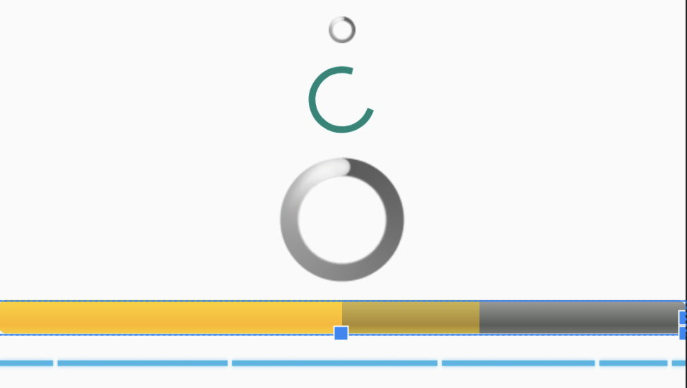
但是这种样式,不得不怀疑Google之前的审美,肯定是不满意的,怎么换样式呢。
看看XML文件,很容易发现,这几个ProgressBar的差异是因为style引起的,随手点开一个@android:style/Widget.ProgressBar.Horizontal 看看。
    <style name="Widget.ProgressBar.Horizontal">
        <item name="indeterminateOnly">false</item>
        <item name="progressDrawable">@drawable/progress_horizontal</item>
        <item name="indeterminateDrawable">@drawable/progress_indeterminate_horizontal</item>
        <item name="minHeight">20dip</item>
        <item name="maxHeight">20dip</item>
        <item name="mirrorForRtl">true</item>
    </style>
很好,估摸着样式就出在progressDrawable/indeterminateDrawable上面,看看 @drawable/progress_horizontal 里面
<layer-list xmlns:android="http://schemas.android.com/apk/res/android">
    <item android:id="@android:id/background">
        <shape>
            <corners android:radius="5dip" />
            <gradient
                    android:startColor="#ff9d9e9d"
                    android:centerColor="#ff5a5d5a"
                    android:centerY="0.75"
                    android:endColor="#ff747674"
                    android:angle="270"/>
        </shape>
    </item>
    <item android:id="@android:id/secondaryProgress">
        <clip>
            <shape>
                <corners android:radius="5dip" />
                <gradient
                        android:startColor="#80ffd300"
                        android:centerColor="#80ffb600"
                        android:centerY="0.75"
                        android:endColor="#a0ffcb00"
                        android:angle="270"/>
            </shape>
        </clip>
    </item>
    <item android:id="@android:id/progress">
        <clip>
            <shape>
                <corners android:radius="5dip" />
                <gradient
                        android:startColor="#ffffd300"
                        android:centerColor="#ffffb600"
                        android:centerY="0.75"
                        android:endColor="#ffffcb00"
                        android:angle="270"/>
            </shape>
        </clip>
    </item>
</layer-list>
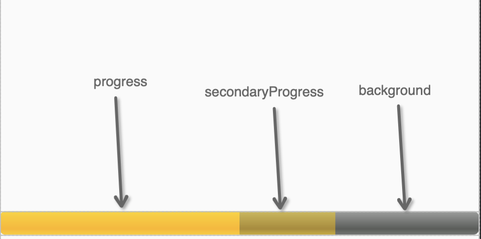
一个样式文件,分别操控了background/secondaryProgress/progress,这样我们很容易推测出
再看看 @drawable/progress_indeterminate_horizontal
<animation-list xmlns:android="http://schemas.android.com/apk/res/android" android:oneshot="false">
    <item android:drawable="@drawable/progressbar_indeterminate1" android:duration="200" />
    <item android:drawable="@drawable/progressbar_indeterminate2" android:duration="200" />
    <item android:drawable="@drawable/progressbar_indeterminate3" android:duration="200" />
</animation-list>
显而易见,这是indeterminate模式下的样式啊,那我们仿写一个不同样式,就很简单了,动手。
styles.xml
<style name="ProgressBar_Beautiful" >
    <item name="android:indeterminateOnly">false</item>
    <item name="android:progressDrawable">@drawable/progress_horizontal_1</item>
    <item name="android:indeterminateDrawable">@drawable/progress_indeterminate_beautiful</item>
    <item name="android:mirrorForRtl">true</item>
</style>
progress_horizontal_1.xml
<?xml version="1.0" encoding="utf-8"?>
<layer-list xmlns:android="http://schemas.android.com/apk/res/android">
    <item android:id="@android:id/background">
        <shape>
            <corners android:radius="25dp" />
            <solid android:color="#FFF0F0F0"/>
        </shape>
    </item>
    <item android:id="@android:id/secondaryProgress">
        <clip>
            <shape>
                <corners android:radius="25dp" />
                <solid android:color="#FFC0EC87"/>
            </shape>
        </clip>
    </item>
    <item android:id="@android:id/progress">
        <clip>
            <shape>
                <corners android:radius="25dp" />
                <solid android:color="#FFA5E05B"/>
            </shape>
        </clip>
    </item>
</layer-list>
progress_indeterminate_beautiful.xml
<?xml version="1.0" encoding="utf-8"?>
<animation-list xmlns:android="http://schemas.android.com/apk/res/android"
    android:oneshot="false">
    <item android:drawable="@drawable/bg_progress_001" android:duration="200" />
    <item android:drawable="@drawable/bg_progress_002" android:duration="200" />
    <item android:drawable="@drawable/bg_progress_003" android:duration="200" />
    <item android:drawable="@drawable/bg_progress_004" android:duration="200" />
</animation-list>
吭呲吭呲就写出来了,看看效果
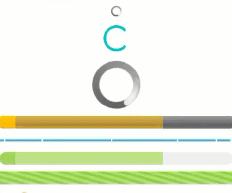
换了个颜色,加了个圆角/ 换了个图片,还行。
我没有去再写环形的ProgressBar了,因为它就是个一个图,疯狂的在旋转。
<animated-rotate xmlns:android="http://schemas.android.com/apk/res/android"
    android:drawable="@drawable/spinner_white_76"
    android:pivotX="50%"
    android:pivotY="50%"
    android:framesCount="12"
    android:frameDuration="100" />
还有一些属性我就不赘述了。你可以根据官方的样式,修一修、改一改,就可以满足一些基本的需求了。
用起来就这么简单,就是因为太简单,更复杂的功能就不是ProgressBar能直接实现的了。比如带个滑块?
3、SeekBar
好吧,ProgressBar的一个子类,也在android.widget下,因为是直接继承,而且就加了个滑块相关的代码,实际上它也非常简单,然我们来看看
<SeekBar
    android:id="@+id/sb_01"
    style="@style/ProgressBar_Beautiful"
    android:layout_width="match_parent"
    android:layout_height="20dp"
    android:layout_marginVertical="10dp"
    android:thumbOffset="1dp"
    android:max="100"
    android:progress="50"
    android:secondaryProgress="70"
    android:splitTrack="false"
    android:thumb="@drawable/icon_seekbar_thum" />
<SeekBar
    android:id="@+id/sb_02"
    style="@style/ProgressBar_Beautiful"
    android:layout_width="match_parent"
    android:layout_height="20dp"
    android:layout_marginVertical="10dp"
    android:max="100"
    android:progress="50"
    android:secondaryProgress="70"
    android:thumb="@drawable/icon_seekbar_thum" />
<SeekBar
    android:id="@+id/sb_03"
    style="@style/ProgressBar_Beautiful"
    android:layout_width="match_parent"
    android:layout_height="20dp"
    android:layout_marginVertical="10dp"
    android:max="100"
    android:progress="100"
    android:secondaryProgress="70"
    android:splitTrack="false"
    android:thumb="@drawable/icon_seekbar_thum" />
<SeekBar
    android:id="@+id/sb_04"
    style="@style/ProgressBar_Beautiful"
    android:layout_width="match_parent"
    android:layout_height="20dp"
    android:layout_marginVertical="10dp"
    android:thumbOffset="1dp"
    android:max="100"
    android:progress="100"
    android:secondaryProgress="70"
    android:splitTrack="false"
    android:thumb="@drawable/icon_seekbar_thum" />
<SeekBar
    android:id="@+id/sb_05"
    style="@style/ProgressBar_Beautiful"
    android:layout_width="match_parent"
    android:layout_height="20dp"
    android:layout_marginVertical="10dp"
    android:max="100"
    android:paddingHorizontal="0dp"
    android:progress="50"
    android:secondaryProgress="70"
    android:thumb="@drawable/icon_seekbar_thum" />
<SeekBar
    android:id="@+id/sb_06"
    style="@style/ProgressBar_Beautiful"
    android:layout_width="match_parent"
    android:layout_height="20dp"
    android:layout_marginVertical="10dp"
    android:max="100"
    android:progress="50"
    android:secondaryProgress="70"
    android:thumb="@null" />
样式就在下面了
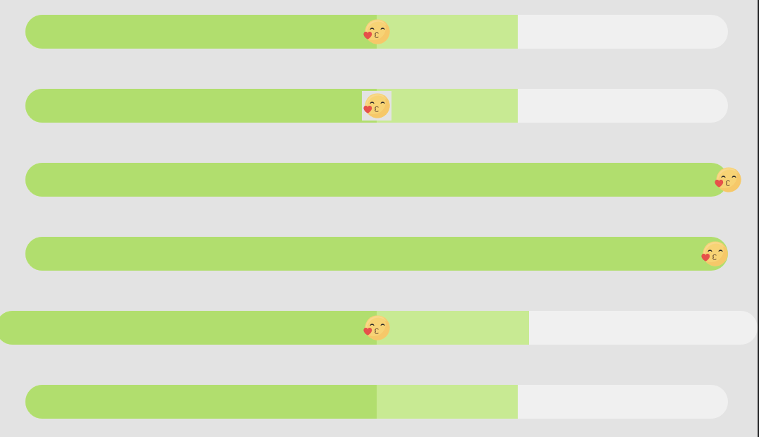
因为Seekbar相较而言就多了个thumb(就是那个滑块),所以就着重说一下滑块,其他的就一笔带过咯。
主要了解的是如何设置自己的thumb和thumb的各种问题
android:thumb="@drawable/icon_seekbar_thum"
设置就这么thumb简单,一个drawable文件解决,我这里对应的是单一图片,不过Google的是带有多种状态的thumb,我们来看看官方是如何实现的
<selector xmlns:android="http://schemas.android.com/apk/res/android"
          android:constantSize="true">
    <item android:state_enabled="false" android:state_pressed="true">
        <bitmap android:src="@drawable/abc_scrubber_control_off_mtrl_alpha"android:gravity="center"/>
    </item>
    <item android:state_enabled="false">
        <bitmap android:src="@drawable/abc_scrubber_control_off_mtrl_alpha"android:gravity="center"/>
    </item>
    <item android:state_pressed="true">
        <bitmap android:src="@drawable/abc_scrubber_control_to_pressed_mtrl_005" android:gravity="center"/>
    </item>
    <item>
        <bitmap android:src="@drawable/abc_scrubber_control_to_pressed_mtrl_000"android:gravity="center"/>
    </item>
</selector>
引用一个drawable,也是一个熟知的selector组,通过对应的item,我们就可以实现在不同的状态下显示不同的thumb了,具体的样式我就不写了,再说ProgressBar的样式的时候也是有类似的操作的
不过你可能发现了,其实这几个样式看起来都差不多,是因为都是我使用Seekbar遇到的问题以及解决方法,我们细说
(1) 自定义的thumb的背景会裁剪出一个正方形,这对于不规则图形来讲是非常难看的

很简单一行
android:splitTrack="false"
修复0。0
(2)thumb的中心点对齐bar的边界,所以thumb是允许超出进度条一点的。有时候我们不需要

很简单一行
android:thumbOffset="1dp"
修复0,0
(3) 你可能发现就算没有写margin和padding,seekbar也不会占满父布局的,是因为它自带padding,所以如果需要去掉

很简单一行
android:paddingHorizontal="0dp"
修复0>0
(4)最后一个,SeekBar但是不想要滑块!为什么不用ProgressBar呢?没别的就是头铁!
很简单一行
android:thumb="@null"
修复0」0
但是要注意的是,此时Seekbar还是能点击的!所以需要把点击事件拦截掉
sb02.setOnTouchListener { _, _ -> true }
真的修复0[]0
好了好了,thumb的监听事件还没说呢
            sb01.setOnSeekBarChangeListener(object : OnSeekBarChangeListener {
                override fun onProgressChanged(p0: SeekBar?, p1: Int, p2: Boolean) {
                    //进度发生改变时会触发
                }
                override fun onStartTrackingTouch(p0: SeekBar?) {
                    //按住SeekBar时会触发
                }
                override fun onStopTrackingTouch(p0: SeekBar?) {
                    //放开SeekBar时触发
                }
            })
没啦,Seekbar就这么多。
还有一个,放在下次讲吧
对了,如果你感觉你的ProgressBar不够流畅,可以用以下这个
bar.setProgress(progress, true)
4、结尾
更多复杂的进度条需求,靠widget的控件,肯定是难以实现的,我们接下来会讲述RatingBar,以及继承ProgressBar,做更多好看的进度条!
以上就是五分了解Android Progress Bar进度条加载的详细内容,更多关于Android Progress Bar的资料请关注我们其它相关文章!
相关推荐
-

Android自定义View实现进度条动画
本文实例为大家分享了Android自定义View实现进度条动画的具体代码,供大家参考,具体内容如下 控件效果 原理: 控制代码/ /更新进度值 val mHandler = object : Handler() { override fun handleMessage(msg: Message?) { progressView.setCurrentProgress(progress1.toFloat()) } } //开启动画,更新
-
Android自定义对话框的简单实现
本文实例为大家分享了Android自定义对话框的具体实现代码,供大家参考,具体内容如下 1.定义对话框的布局 <?xml version="1.0" encoding="utf-8"?> <RelativeLayout xmlns:android="http://schemas.android.com/apk/res/android" android:layout_width="match_parent&quo
-
Android实现简单实用的垂直进度条
本文实例为大家分享了Android实现简单垂直进度条的具体代码,供大家参考,具体内容如下 代码注释特别清晰,就不多解释了 支持属性: progress_radius 进度条圆角大小 progress_border_enable 进度条是否有边框 progress_gradient_enable 进度条颜色是否渐变 progress_start_color 从上到下进度条开始的渐变色 progress_end_color 从上到下进度条结束的渐变色 progress_sol
-
Android对话框使用方法详解
对话框(Dialog)是Android系统在Activity或者其他组件运行过程中提供的一种提示机制.它可以帮助应用完成一些必要的提示功能,同时提供一些与用户交互的功能. 对话框分为很多种,下面将一一介绍. 1.提示对话框 Android系统提供的对话框父类为Dialog, 里面并没有实现对话框的具体类型,比如单选.多选.列表等对话框,仅提供一个框架和规范.系统为开发者提供了一个 多功能的对话框类AlertDialog, 里面封装了各种对话框的样式,开发者只须提供相应的显示数据和按键的响应监听就
-
Android开发基础使用ProgressBar加载进度条示例
目录 前言 使用方法 总结 前言 之前我们用过WebView类,打开网页时就会出现加载网页的情况,为了让我们直观的感受到网页加载到什么程度而不是白白干等着空白页,于是加载进度条就是一个很好的展示方式,而通常情况下,当我们的数据未加载完成时就会去使用进度条,而ProgressBar就是用于界面上显示进度条的,下面让我们看看这个控件的使用方法. 使用方法 首先我们将ProgressBar控件加到布局中: <?xml version="1.0" encoding="utf-8
-
Android入门之利用Spinner实现弹出选择对话框
目录 介绍 项目结构 前端代码 activity_main.xml item_spin_guns.xml 后端代码 GunBean.java GenericAdapter.java MainActivity.java 介绍 Spinner是一种点一下后供用户可以上下选择用的组件. 我们直接来看一个例子说明这个组件是做什么用的. 我们放大点看 我们这次的课程目标就是实现这样的一种点一下然后弹出选择框的样式. 项目结构 随着前几章对Adapter知识的牢固掌握,我们可以看到,这个例子依旧使用的是Ad
-
android实现简单进度条ProgressBar效果
本文实例为大家分享了android实现简单进度条ProgressBar的具体代码,供大家参考,具体内容如下 记录一下今天学习的进度条ProgressBar 1.在布局文件中添加ProgressBar <ProgressBar android:id="@+id/progressbar" android:layout_width="match_parent" android:layout_height="w
-
Android 自定义view实现进度条加载效果实例代码
这个其实很简单,思路是这样的,就是拿view的宽度,除以点的点的宽度+二个点 之间的间距,就可以算出大概能画出几个点出来,然后就通过canvas画出点,再然后就是每隔多少时间把上面移动的点不断的去改变它的坐标就可以, 效果如下: 分析图: 代码如下: package com.example.dotloadview; import android.content.Context; import android.graphics.Bitmap; import android.graphics.Bit
-
简单实现js进度条加载效果
本文实例为大家分享了js进度条加载效果的具体代码,供大家参考,具体内容如下 <!DOCTYPE html> <html lang="en"> <head> <meta charset="UTF-8"> <title>下载进度</title> <style> /*定义父容器*/ .content{ width: 500px; height: 200px; background: pin
-
python实现文本进度条 程序进度条 加载进度条 单行刷新功能
python实现文本进度条 程序进度条 加载进度条 单行刷新功能,具体内容如下所示: 利用time库来替代某个程序 的进行过程,做实例, 思路是,简单打印出来程序进度 单行刷新关键是\r, python默认是print后换行,所以加一个\r是光标回退到之前位置 import time tm=10 print('{:-^18}'.format('开始')) for i in range(tm+1): a='#'*i b='.'*(tm-i) c=(i/tm)*100 print('\r{:^3.0
-
Android自定义圆弧进度条加数字动态变化
本文实例为大家分享了Android自定义圆弧进度条数字变化的具体代码,供大家参考,具体内容如下 效果如下: 思路:一个内环圆弧和一个外环圆弧,因为有一个圆圈是在圆弧上做圆周运动,所以在画圆的时候必须要得到圆弧上的各个点的坐标,这里其实就用到了PathMeasure这个类,可以帮我们拿到这些点,在画圆弧的时候也理所应当的要使用path,然后根据外界动态的传值进行重绘就能达到动态的效果 代码如下: public class ProgressPathRainbow extends View { pri
-
网页加载时页面显示进度条加载完成之后显示网页内容
现在网上有很多网页加载进度条 ,但大多都是时间固定的. 下面的当查询大量数据时,网页加载较慢,在网页加载时,显示进度条,当网页加载完成时,进度条消失,显示网页已经加载完成的内容. 复制代码 代码如下: <html> <script language=VBScript> Dim Bar, SP Bar = 0 SP = 100 Function Window_onLoad() Bar = 95 SP = 10 End Function Function Count() if Bar
-
Android自定义带进度条WebView仿微信加载过程
在正常开发中,我们客户端需要用webView加载网页,再遇到网络慢或者访问的服务器响应时,页面是空白的,所以为了用户更好的体验,我们可以提供一个正在加载的进度条,提示用户正在加载. 本文结构: 1.自定义webView 2.在应用中的使用 3.效果展示 一.自定义webView 1.首先定义一个类,继承webView,并首先构造方法 public class ProgressBarWebView extends WebView{} 自定义控件,先实现构造方法, 第一中是程序内部实例化采用,传入c
-
Android 自定义标题栏 显示网页加载进度的方法实例
这阵子在做Lephone的适配,测试组提交一个bug:标题栏的文字较长时没有显示完全,其实这并不能算个bug,并且这个问题在以前其他机器也没有出现,只是说在Lephone的这个平台上显示得不怎么美观,因为联想将原生的标题栏UI进行了修改.修改的过程中遇到了一个难题,系统自带的那个标题栏进度总能够到达100%后渐退,但是我每次最后到100%那一段显示不全,尝试了用线程程序死了卡主了不说,还是一样的效果,后来同事一句话提醒了我用动画.确实是这样我猜系统的也是这样实现的,等进度到达100%后,用动画改
-
Android实现下载进度条效果
目录 最终效果和对比vivo商店效果 分析1 - 计算进度 分析2 - 绘制圆角矩形 解决方案 分析3 - 绘制文字和交汇 手势拓展 最终效果和对比vivo商店效果 vivo应用商店下载效果: 最终实现效果: 分析1 - 计算进度 进度计算就比较简单了,我们通过复写onSizeChanged()方法,获取到控件的宽后,先计算当前进度百分比,再将百分比乘以宽度,就可以得到应该绘制的宽度了. 绘制圆角矩形需要传一个Rect,Rect的构造方法需要传4个位置,分别是left.top.right.bot
-
Android WebView线性进度条实例详解
推荐阅读:Android Webview添加网页加载进度条实例详解 先给大家展示下效果图:这个效果图大家一看就懂,在生活经常见到 1.wevbview_progressbar.xml <layer-list xmlns:android="http://schemas.android.com/apk/res/android" > <!-- 背景 --> <item android:id="@android:id/background"&g
-
Android 实现带进度条的WebView的实例
Android 实现带进度条的WebView的实例 1. WebView加载网页方法 //加载本地资源 loadUrl("file:///android_asset/example.html"); //加载网络资源 loadUrl("http://baidu.com"); 2. 带进度的Drawable文件view_progress_webview <?xml version="1.0" encoding="utf-8"